Best creative practices
These recommendations are meant to provide guidelines for creating your visual to achieve the best possible results. If you have any questions, we can provide assistance as well as production services.
General information
for best results
• Avoid thin fonts that can be difficult to read
• Less is often more effective in conveying a clear message and brand image
• Since there is no sound, keep your message clear and concise
• Avoid existing videos with people talking
• Draw attention with bright colours
• Good contrast draws attention and makes the text easier to read
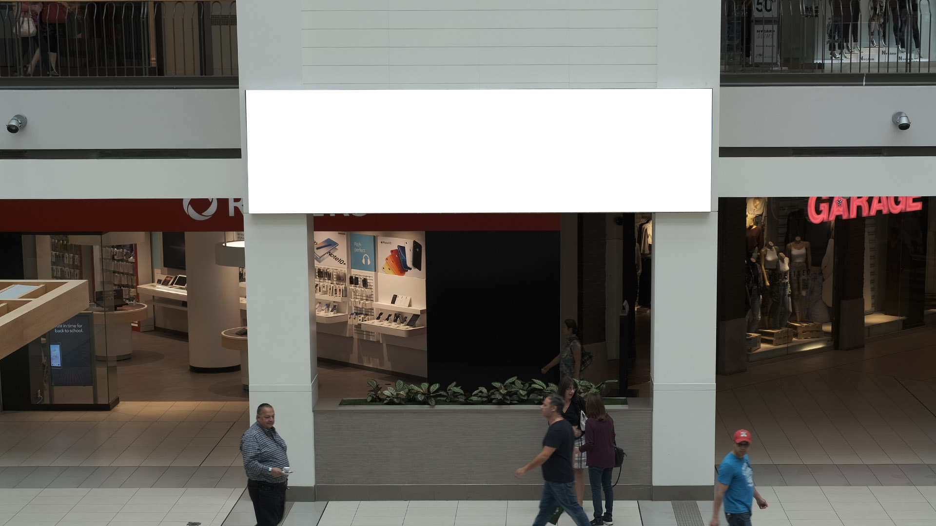
Digital Horizontal
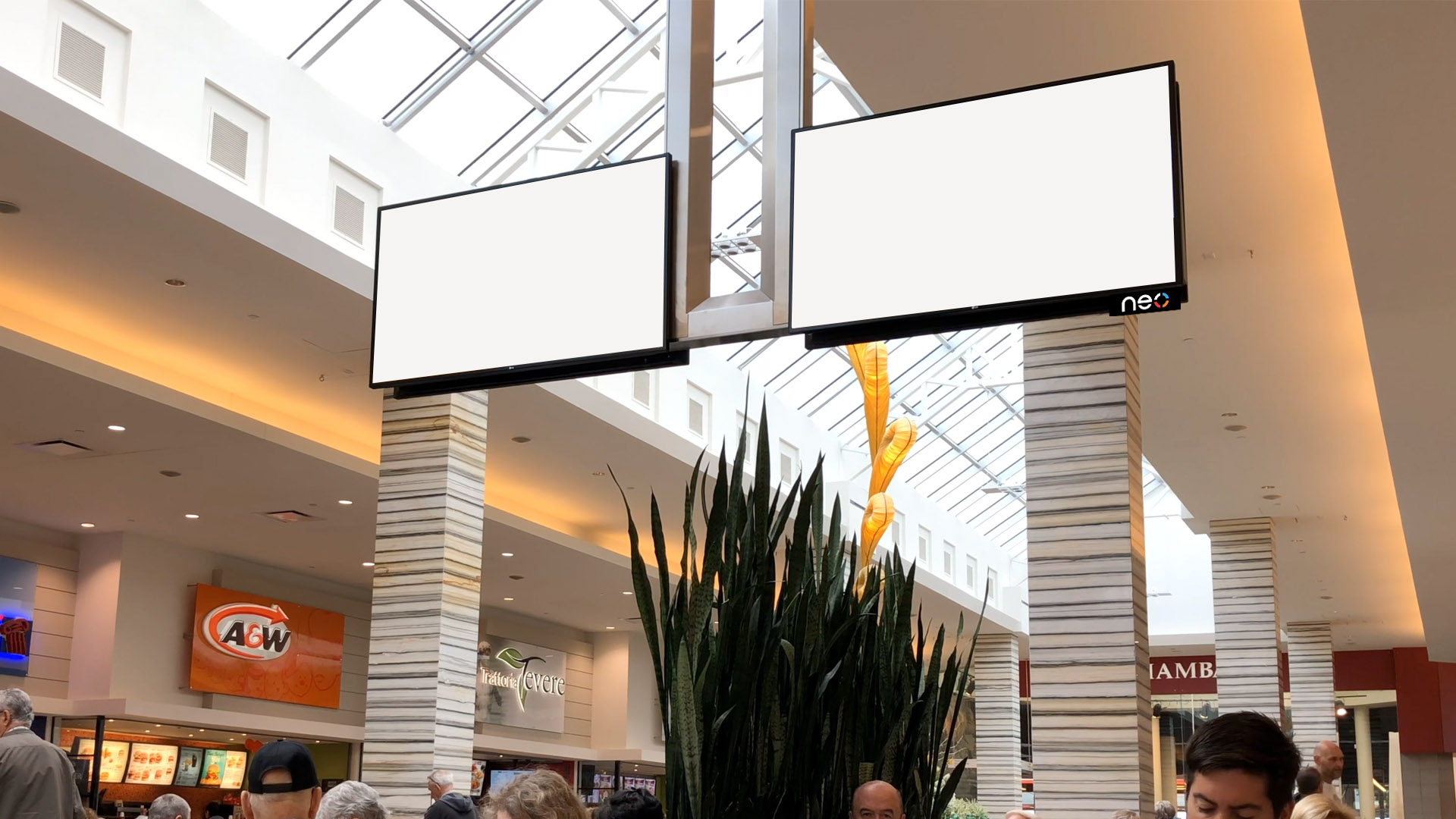
2-screen configuration
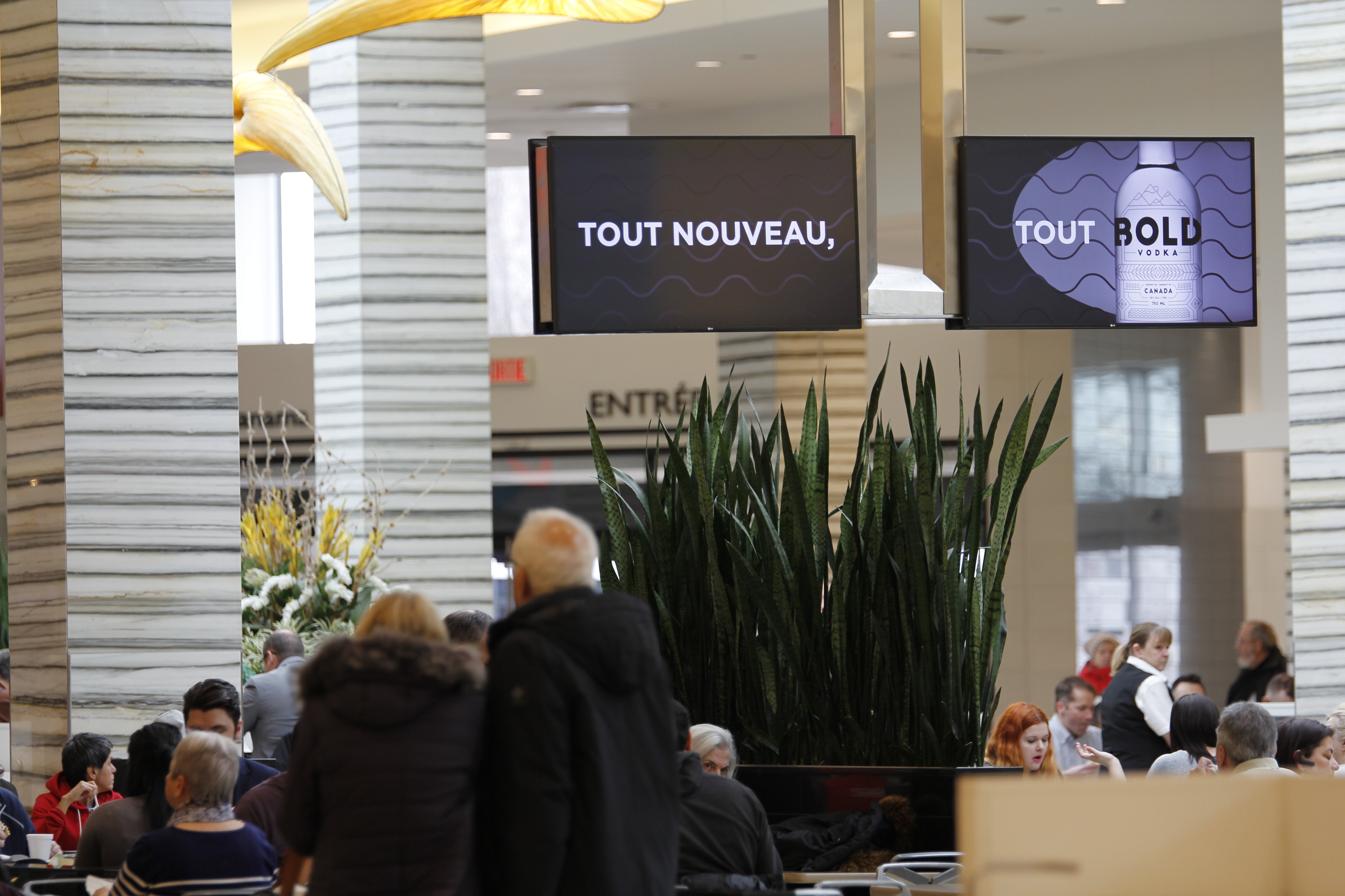
Provide two different static messages or provide the same static visual on both screens.
Best usage is a confluent design that uses the panoramic setup so the creative flows from one screen to the next.
Important that text remain centered on each screen and not travel between.
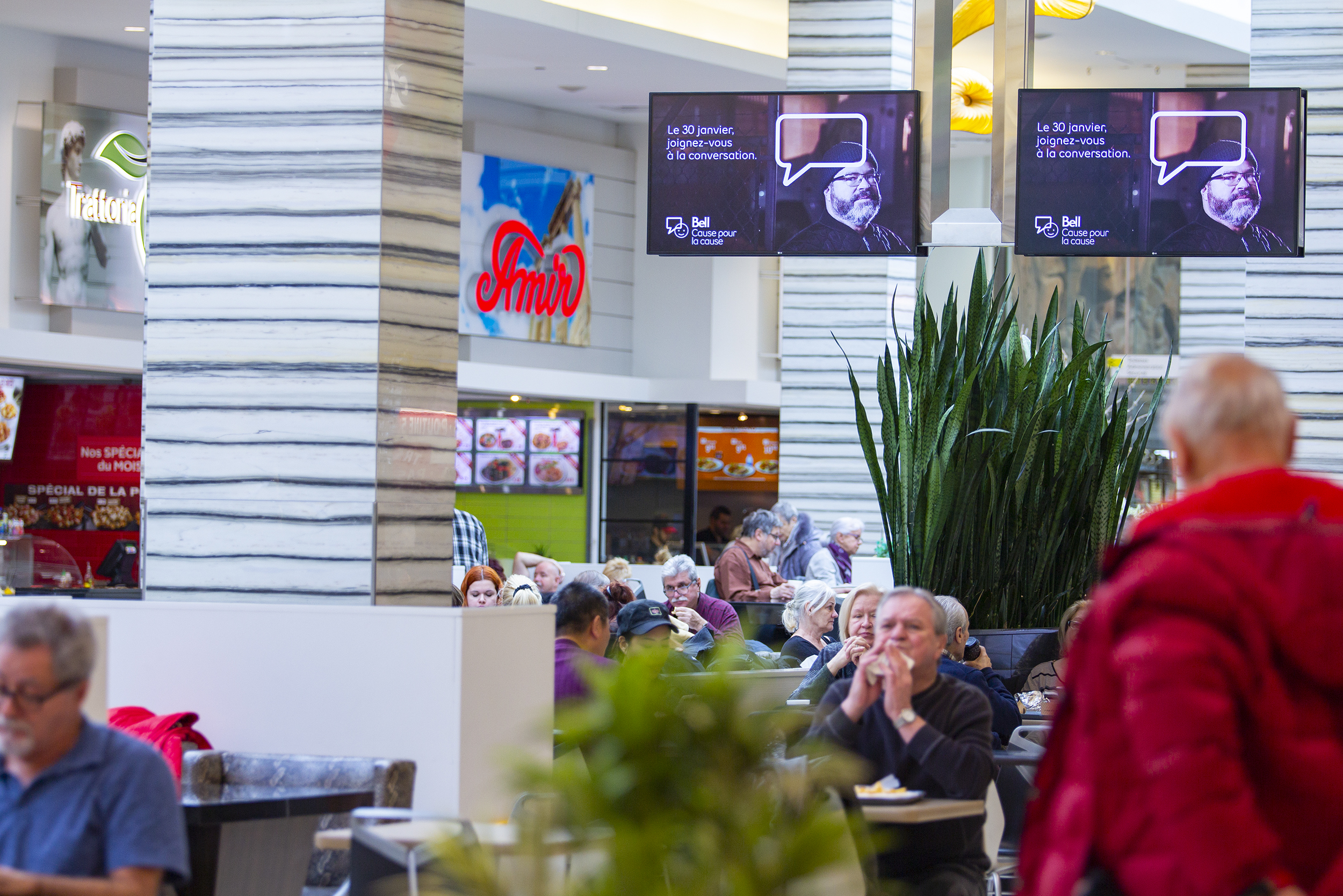
-
Spot Duration15 seconds
-
HD Screen
Resolution1920x1080 -
Combined
Aspect Ratio32:9 (Panoramic) -
AudioNo
- Separation between screens 18
- Supports both static and video
- Maximum recommended verbiage: 15 words for 15 seconds
- Font size should be minimum 60pts (Except for legal)
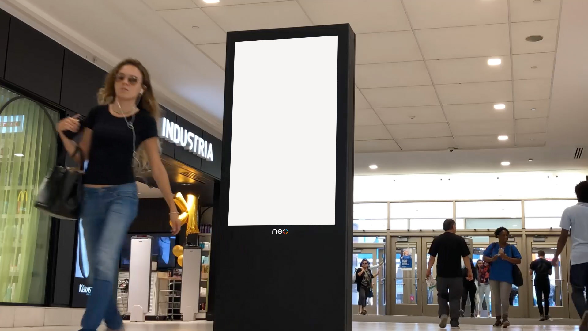
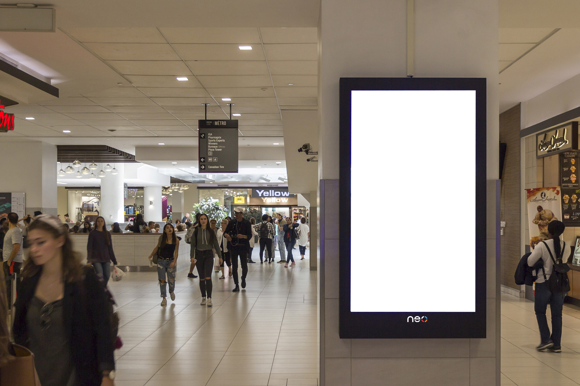
Digital Vertical
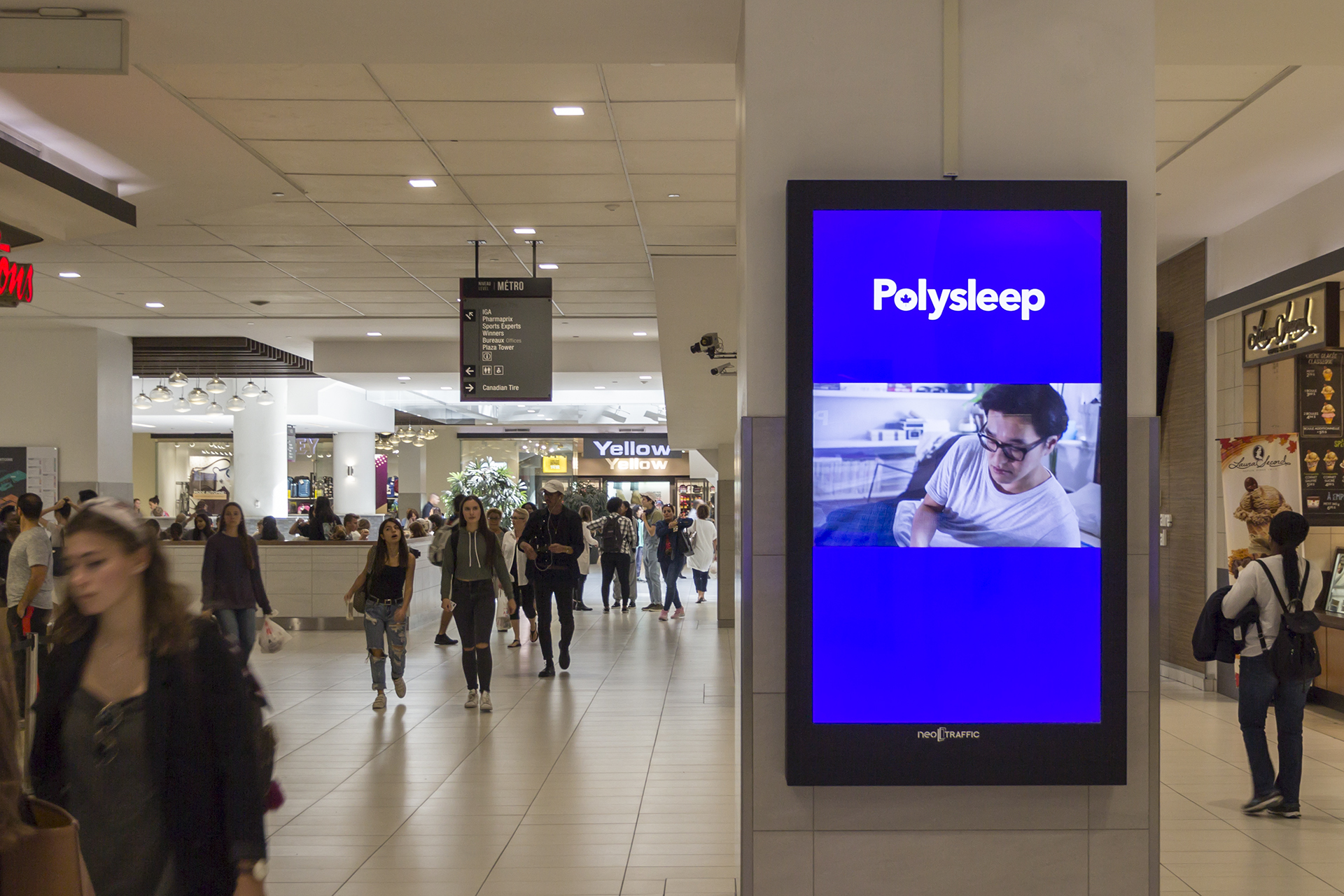
- Supports both static and video
- Maximum recommended verbiage: 10 words for 10 seconds
- Font size should be minimum 40 pts
-
Spot Duration10 seconds
-
HD Screen Resolution1080x1920
-
Combined Aspect Ratio9:16
-
AudioNo
Make your own NEO templates!
See your upcoming campaigns by uploading your visuals to adjust your designs and optimize the impact of your campaigns.
